How I Saved My Client Thousands in Printing Costs with a Smarter Packaging Design

Designing two pouch variants while reducing printing complexity without compromising the visual design
When I started working on the packaging for Paliwal's Jeeravan, the project involved creating packaging for two variants:
Paliwal's Jeeravan
Paliwal's Lahsun Jeeravan
At first glance, designing two variants may seem like a straightforward branding exercise.
But in FMCG packaging, there's another important question that designers need to ask:
How will this design be printed?
For this project, that question led to a significant production optimization.
The original requirement was 12 cylinders.
Through a carefully structured artwork system, I was able to bring that down to 7 cylinders.
That's a reduction of 5 cylinders, or approximately 41.7% fewer cylinders.
And the interesting part is what happens when Paliwal's wants to introduce another variant.

The Challenge: Two Designs, One Efficient Printing System
The two Jeeravan variants needed to look different enough to clearly communicate their products.
The Regular Jeeravan design uses a warm orange/red visual identity, while Lahsun Jeeravan uses a distinct purple identity.
But I didn't want to create two completely independent artworks.
Instead, I looked at the packaging as a system.
Which elements really need to change?
Which elements can be shared?
And how can the artwork be structured so that future variants don't require rebuilding the entire printing setup?

From 12 Cylinders to 7
The initial artwork requirement would have resulted in:
12 cylinders for the two variants.
Rather than treating each variant as a completely separate design, I structured the artwork so that the common visual elements could be shared wherever possible.
The final artwork was optimized to:
7 cylinders
That means:
12 → 7
5 fewer cylinders
≈41.7% reduction in cylinder count
This wasn't achieved by removing the important design elements.
It came from designing the artwork with the printing process in mind.

The Smart Part: Adding Future Variants
This is where the system becomes even more useful for the client.
The common design elements are already structured within the existing artwork system.
When Paliwal's wants to create another variant, the major shared printing elements don't need to be recreated from scratch.
Only the black product-information cylinder needs to change.
That cylinder contains the variant-specific information such as the relevant product details.
So the basic system becomes:
Existing common cylinders + 1 new black information cylinder = New Variant
Instead of creating an entirely new set of cylinders for every new flavour or variant.

Why the Black Cylinder Matters
The black printing separation is used for the product-specific information.
This is where the variant can be updated while keeping the core visual language consistent.
That means the brand can potentially expand its range without unnecessarily duplicating the entire printing setup.
From a design perspective, this creates something more valuable than two individual pouch designs.
It creates a scalable packaging system.
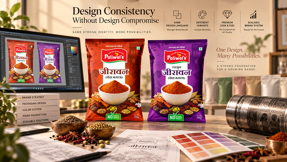
Design Consistency Without Design Compromise
The biggest priority was not to make the packaging look like it had been compromised for production.
The two variants still needed their own identities.
Regular Jeeravan
Warm orange/red visual direction.
Lahsun Jeeravan
Distinct purple visual direction.
But the underlying design language remains consistent through:
Paliwal's branding
Typography
Layout structure
Illustration style
Product hierarchy
Central design composition
Overall visual identity
So when the two pouches are placed next to each other, they immediately feel like part of the same product family.

The Designer's Role Goes Beyond Visuals
This project is a good example of why packaging design isn't simply about making an attractive front panel.
A packaging designer needs to think about the entire journey:
Concept → Artwork → Prepress → Cylinders → Printing → Production → Finished Pouch
If production considerations are ignored until the end, opportunities for optimization can be missed.
In this project, the production requirement became part of the design thinking from the beginning.

The Result
The final packaging system achieved:
12 cylinders → 7 cylinders
while maintaining the visual quality and differentiation of both Jeeravan variants.
And the system was structured so that:
Future variants require only the black product-information cylinder to be changed.
That means the client gets a more scalable approach to expanding the product range.
The goal wasn't simply to reduce the number of cylinders.
The goal was to reduce unnecessary production complexity while protecting the design.
What I Take Away From This Project
For me, this is what good packaging design should do.
It should work for the:
Consumer
It should work for the:
Brand
And it should work for the:
Printer
A beautiful design is only one part of successful packaging.
Understanding how that design will actually be manufactured is equally important.
Good packaging design doesn't stop at the artwork. It considers what happens when the artwork goes to production.
The Numbers at a Glance
Original | Optimized | |
Cylinders | 12 | 7 |
Reduction | 5 cylinders | |
Reduction % | ≈41.7% | |
Additional variant | Full setup | Only black information cylinder |
Actual monetary savings depend on the printer's cylinder charges, printing process, quantities and production terms.


Comments